Fund Transfer to Other Bank Account
Design Guidelines
Overview
This guide assumes you have already configured your webpage or application on other platforms for the bank selection button and are familiar with Krungthai logo best practices.
Krungthai Bank Logo
Logo variation
The buttons below are recommended. The way to use them depends on the app's appearance and environment.
![]()
Design resource
Download Circular Logo
Logo Text
The logo text for Krungthai logo is 'Krungthai'. Logo must only be use with logo text with correct proportion. Other fonts are not allowed on the 'Vayupaksa Bird' logo.
![]()
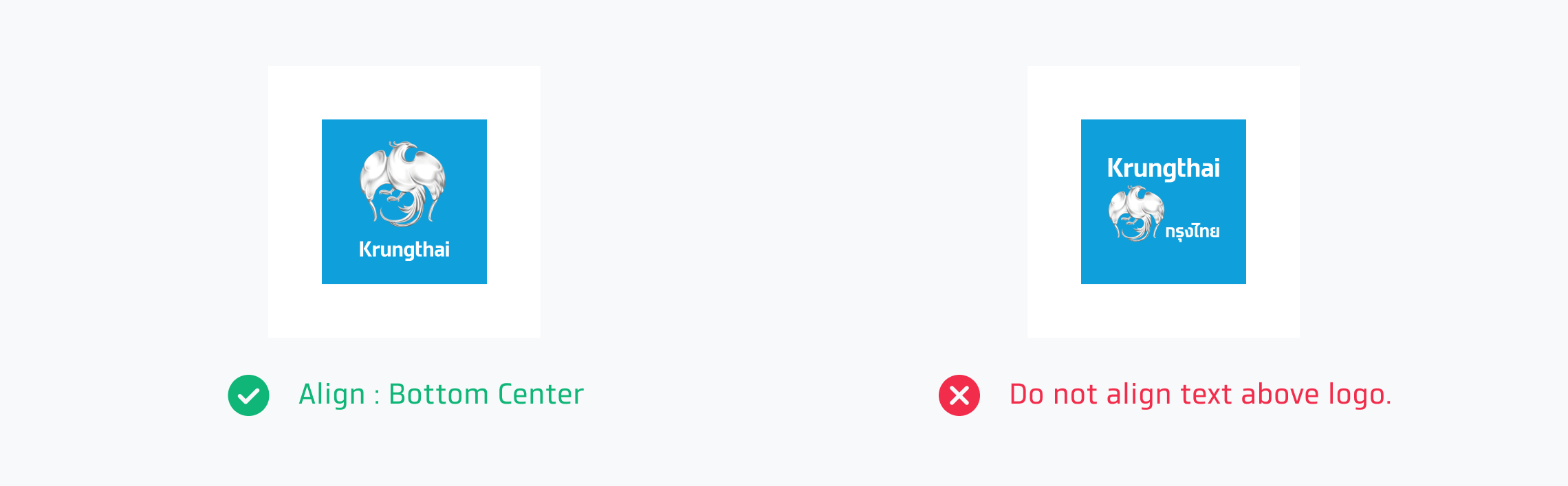
Text Alignment
'Vayupaksa Bird' logo must always be above or beside text. When text is below logo, text should be aligned center. Logo text should be align according to Krungthai’s recommendation and must not be moved or distorted.
Design resource

Download Rectangular Logo with TH text

Download Rectangular Logo with EN text
Color Choices
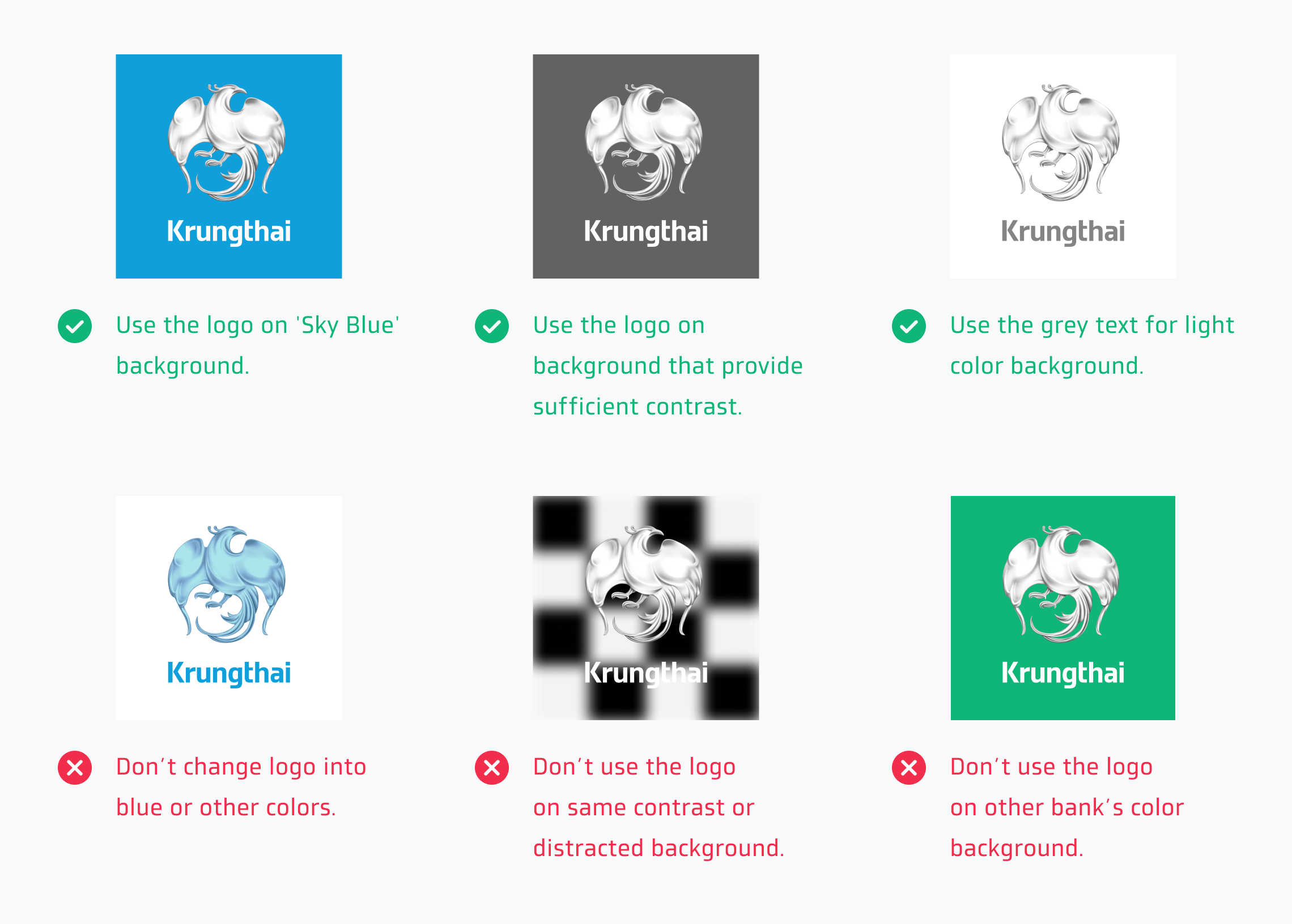
The primary background color for 'Vayupaksa Bird' logo is 'Sky Blue' color. Incase a logo is used on white background, the logo text can be in grey color. But the color of 'Vayupaksa Bird' will remain the same.
Use the logo on the background that provides enough contrast and matches well. The logo must not distracted by other element in the background.
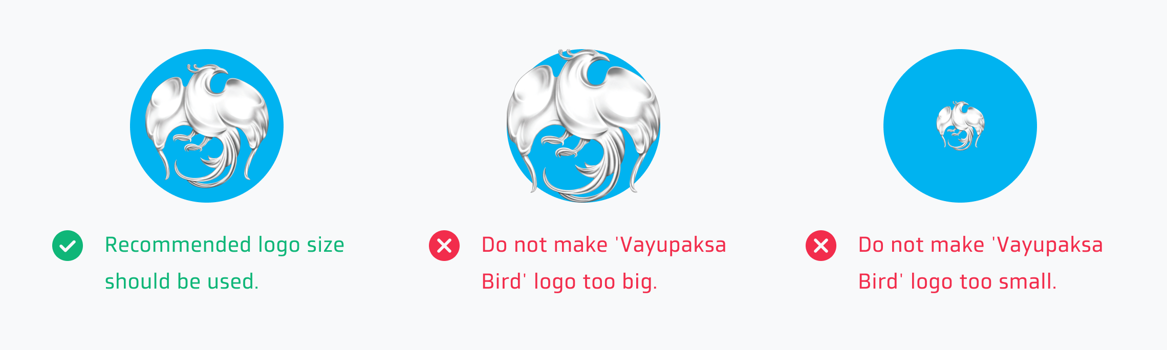
Sizing
These are button sizes that are usually used in the mobile and web application the sizing number is not fix. But you can adjust the sizing to match the appearance of other buttons. A logo always has a 1:1 aspect ratio.
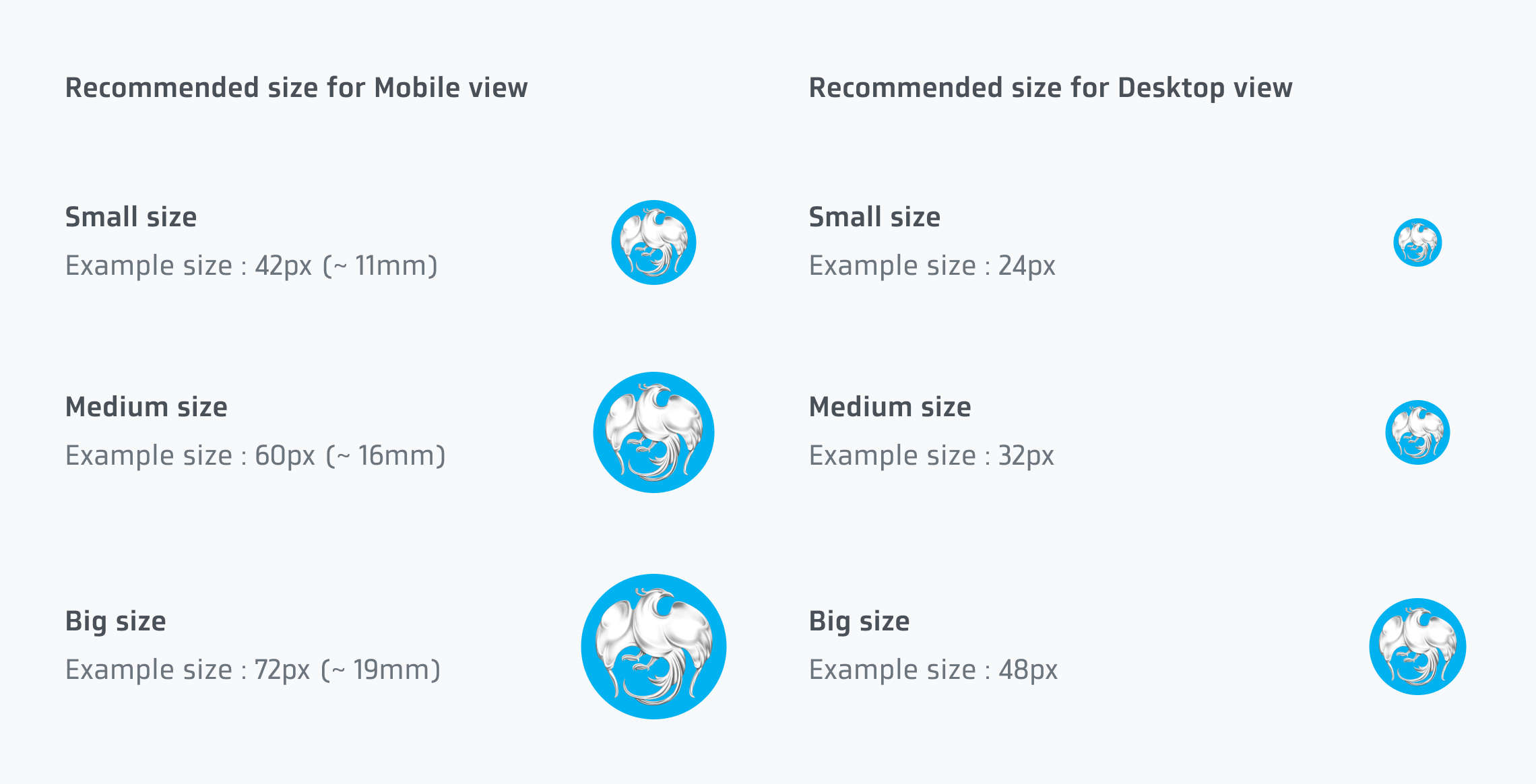
Here are the recommendation of logo sizing on the button.
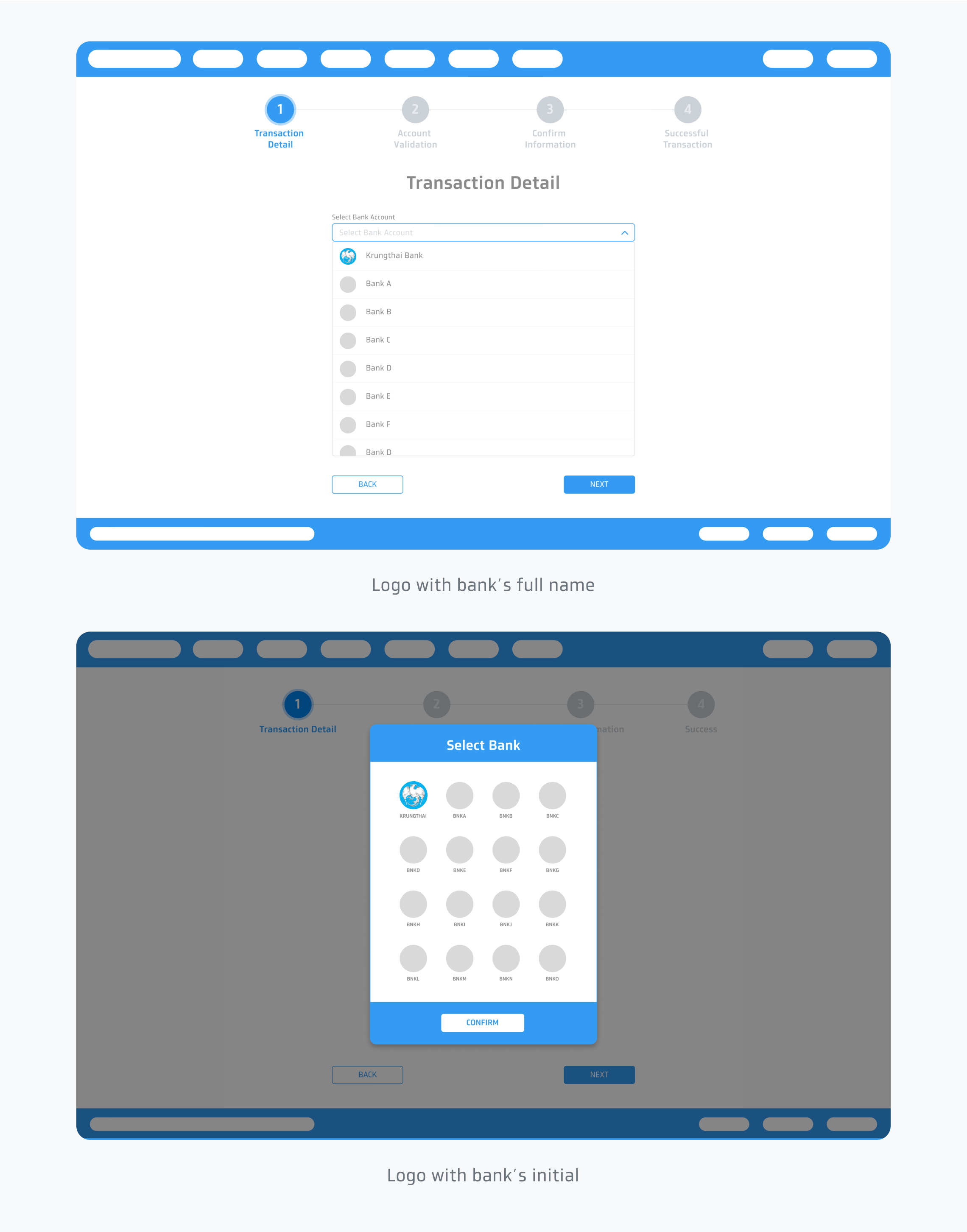
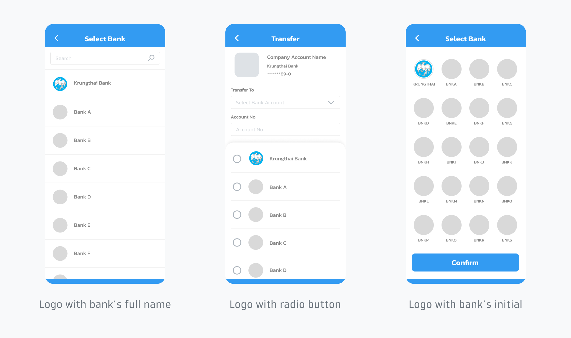
Usage
The way to use them depends on the app's appearance and environment. For example, use logo with text or logo with bank’s initial for bank account selection.
Mobile view
Desktop view